I recently looked more closely into current offerings of
taxonomy software to prepare for an upcoming presentation at the SLA conference in Cleveland in June: “Taxonomy Tools and Tool Evaluation.” I will speak about the
tools, and my co-presenter, Marti Heyman, will speak about how to evaluate
them. I had last contacted various software vendors in 2015 when I was writing
the second edition for my book, The Accidental Taxonomist. I had previously
blogged on Taxonomy Software Trends in January 2015 and observed that, since
researching software for my first edition in 2009, there is more
cloud/web-based software, more SKOS/RDF/Semantic web framework software, and
more plugins to SharePoint, content management systems, and search engines.
Those trends continue. Now that I look into taxonomy software again, the
additional trends I see are taxonomy, thesaurus, and ontology tool convergence and graphical vocabulary
visualization.
Taxonomy, thesaurus, and ontology software convergence
Originally there was thesaurus management software (also used
for any taxonomies), such as MultiTes, Data Harmony Thesaurus Manager, Synaptica
KMS, and other products that no longer exist; and ontology management software, such as TopBraid Composer, Protégé, ad others. The two kinds of software were very distinct,
from different vendors, based on completely different standards and models,
with different features, used by different users, for different purposes.
Now, we don’t hear as much about “thesaurus software” as
before, but rather vocabulary/taxonomy/knowledge organization system (KOS)/ontology
software, where the same software tool supports thesaurus standards (ANSI/NISO
Z39.19 or ISO 25964) and ontology standards (OWL and RDF), and especially the
SKOS (Simple Knowledge Organization System) model for any kind of controlled vocabulary. This
makes sense, because an organization often has needs for more than one kind of
controlled vocabulary. Newer software offerings have combined taxonomy,
thesaurus, and ontology software into one. These include Smartlogic Semaphore,
PoolParty, Synaptica Graphite, TopBraid Enterprise Data Governance’s Vocabulary Manager, Mondeca Intelligent Topic Manager, and VocBench
Visualizations of taxonomies, thesauri, and ontologies
Interactive visualization charts/graphs of taxonomies (what I shall call all
controlled vocabularies here) are not something I had paid much attention to,
because the feature is not considered so important by a professional taxonomist
for creating taxonomies. However, while taxonomists are the primary users of
taxonomy management software, other stakeholders in taxonomies are important
secondary users. These people include content managers, content strategists, project
managers, knowledge managers, information product managers, user
interface/experience designers, and subject matter experts. Rather than
creating taxonomies, these various stakeholders need to view draft taxonomies
and provide feedback on them. Viewing the taxonomy in the user interface used
by the taxonomist is often not practical or intuitive. However, viewing the
taxonomy as the end-user will see view it may not be possible, because the
taxonomy has not yet been implemented into its final system or product.
Therefore, a taxonomy visualization feature of taxonomy management software can
be quite useful for stakeholder review and input.
Visualizations are especially useful for ontologies with
their semantic relationships, but they are also helpful for taxonomies and
thesauri. With the convergence of taxonomy, thesaurus, and ontology-creation
capabilities in the same software, vocabulary visualization has become a more
common feature. However, they are not the
same in all vocabulary management software products. Following are some varied
examples of visualizations. In many cases, they are interactive, whereby the
user can drag and reposition the nodes.
Data Harmony Thesaurus Master offers a “sunburst”
visualization for hierarchical taxonomies, as an alternative to the inverted
tree display, which is available in the editing interface of the software.
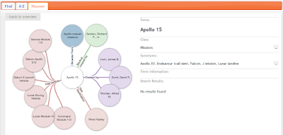
Synaptica KMS has a node and link relationship display for taxonomies and thesauri, where relationships do not need to be defined. Synaptica Graphite will have a new directed-graph visualizer feature added later this year.
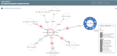
Semaphore, Mondeca, and TopBraid EDG Vocabulary Management each have a node and link relationship display for ontologies that additionally describes the types of relationships.
 |
Visualization from Synaptica KMS
|
Semaphore, Mondeca, and TopBraid EDG Vocabulary Management each have a node and link relationship display for ontologies that additionally describes the types of relationships.
 |
| Visualization from Semaphore |
 |
| Visualization from Mondeca ITM |
 |
| Visualization from TopBraid EDG Vocabulary Management |
PoolParty offers a different type of visualization, focusing on the relationships of a selected concept, with each type color-coded.
 |
Visualization from PoolParty
|

No comments:
Post a Comment